I think it was easier to work with the old menu. Now one has to scan 3 columns, I think scrolling down to the right remote is quicker instead of trying to locate in a 3 column layout. Also, it’s hard to use it on mobile, it’s not intuitive that one can scroll to the right.
I think the earlier menu with the icons is better, maybe those generic icons don’t make sense but it’s quicker to find say “Google Drive” in the single column layout with icons.
Edit: One more thing, with the current menu, one has to scroll the entire page, that’s a lot of moving text, in the old menu just the menu contents moved when scrolling, it’s easier to track things there in my opinion.
First impression is that it looks good. A nice improvement. Good job!
Definitely feels more modern.
Exactly.
I think it was easier to work with the old menu. Now one has to scan 3 columns, I think scrolling down to the right remote is quicker instead of trying to locate in a 3 column layout.
I see what is meant there. The storage systems menu is a bit overwhelming. Not sure the old one is easier after some time, though, when one gets used to the new...? A search/filter box that removes all but the matching ones from the drop down would maybe help, but probably takes some js/css, and ux design, ninja skills to get right, and it's not worth spending that much time on I think. For the command drop down I think the new version is easier to navigate from the get go. And also, I find it useful to see all commands at once rather than scrolling down in a short list, I think it helps when you are not exactly sure which command you are looking for. So overall, I definitely prefer the new one.
The left hand table of contents have this hovering effect that we to some degree have had in the old version as well. I don't know how to describe it. But you see it in the filtering page, as you hover down the items the complete text of the current item is shown and wrapped over multiple lines, creating this visual effect which is a bit disturbing to my eyes. However, it is useful to see the entire header text, I guess, so I don't know.
Nice to see that inline code does not have the red font anymore, this looks much better in the new version. On first look it is a bit similar to links, though. Is it same font color, but with a background color on the code? I found that I had to hover over several times to remember which is what. But will learn it and get used to it quickly enough.
That was just some of my first thoughts. Will test it more later.
Thank you for your comments. I did think of a filter box but thought that was too techy. I might have a play. There are a lot of backends perhaps too many for a menu - maybe there should be an index page with a filter box.
The S3 providers aren't on that menu - maybe they should be on a new index page...
We had that before then we took it out and I put it back again because I like to see the whole text. I see what you mean though. If you don't want the menu to shimmer we could show the full text in a hover over box. I think we tried having it overhang the menu too but that was weird for really long titles.
We had that before then we took it out and I put it back again because I like to see the whole text. I see what you mean though. If you don't want the menu to shimmer we could show the full text in a hover over box. I think we tried having it overhang the menu too but that was weird for really long titles.
Oh yes, I remember that now. I'm ok with it as it is! ...that is; until someone are able to come up with a design that avoids the shimmer while allowing the full text to be seen..
Also, it’s hard to use it on mobile, it’s not intuitive that one can scroll to the right.
I tried it on my phone, and see the same. Is there some extra hint we can put in the dropdown, such as a right arrow or "more..." in the lower right corner, maybe even as a link that scrolls one "page" to the right if possible? Or will it just be clutter..? I kind of like the current clean minimalistic style also.. Oh lord...
Also on phone, on small screen, the start page is a bit crowded. I think the logo down below the header could have been omitted entirely then:
It was always a “problem“ but maybe it is good occasion to fix it.
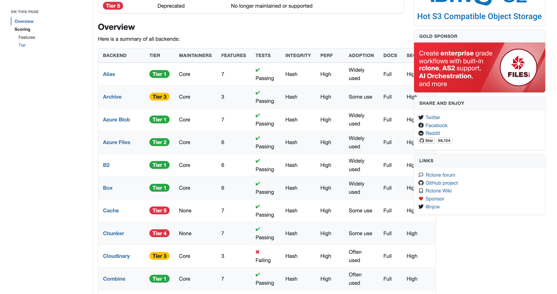
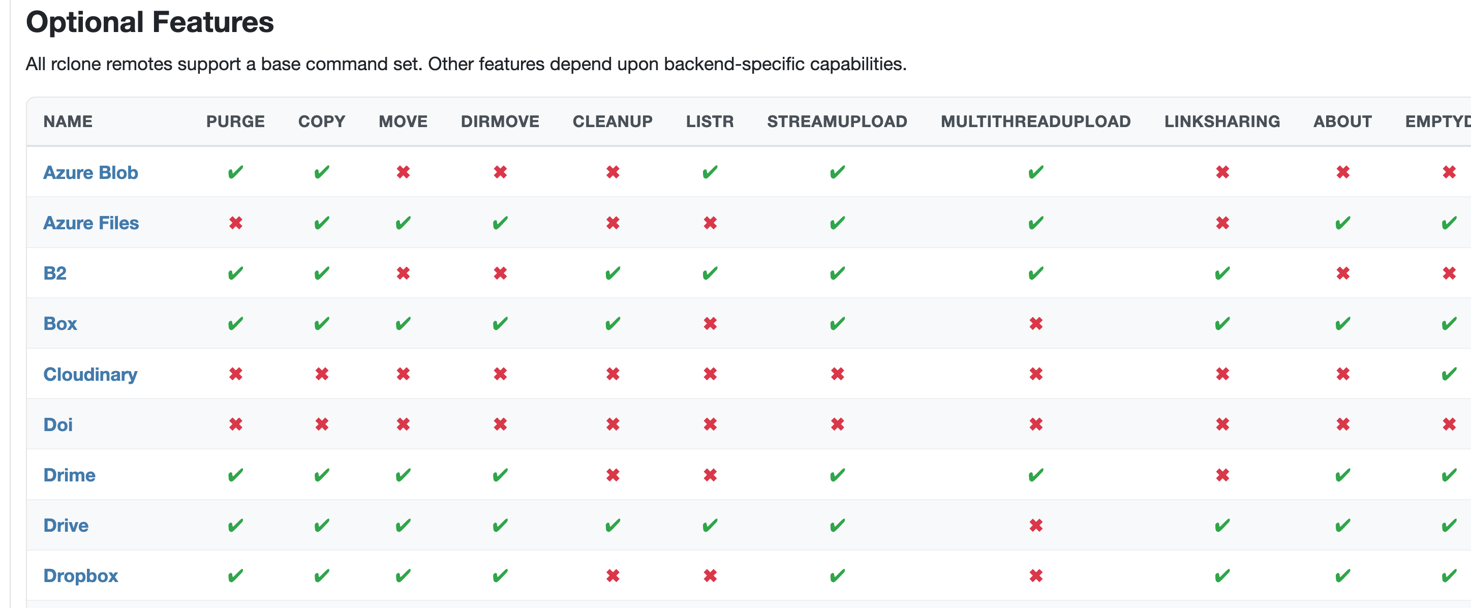
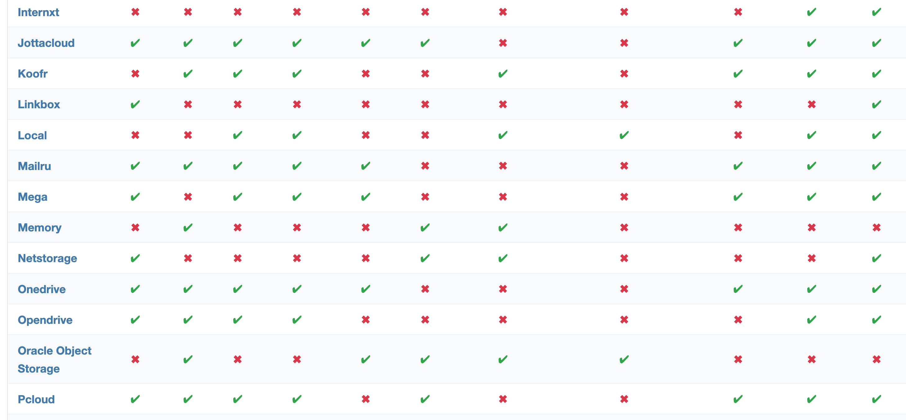
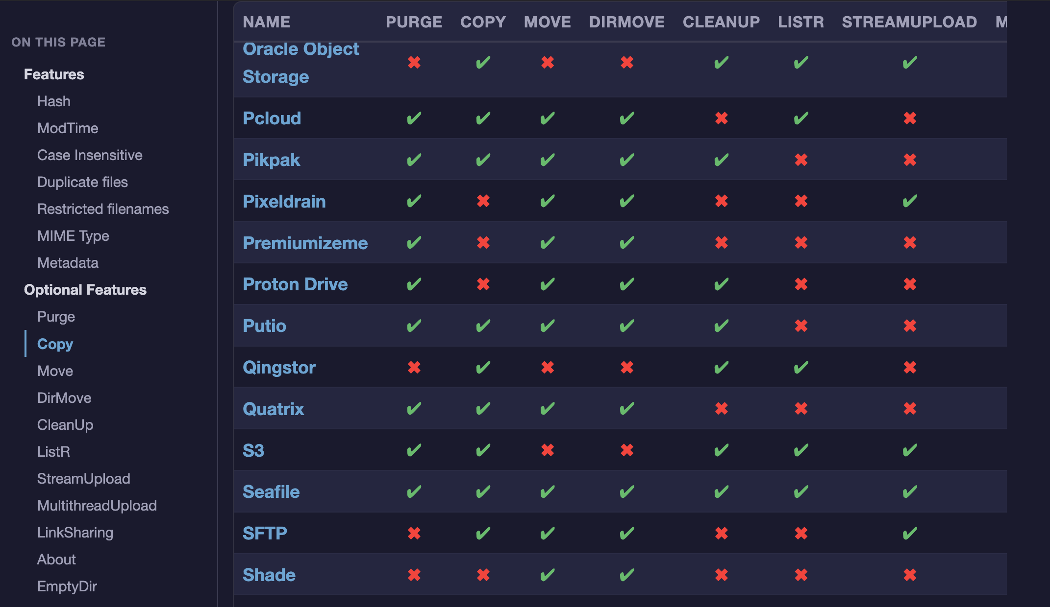
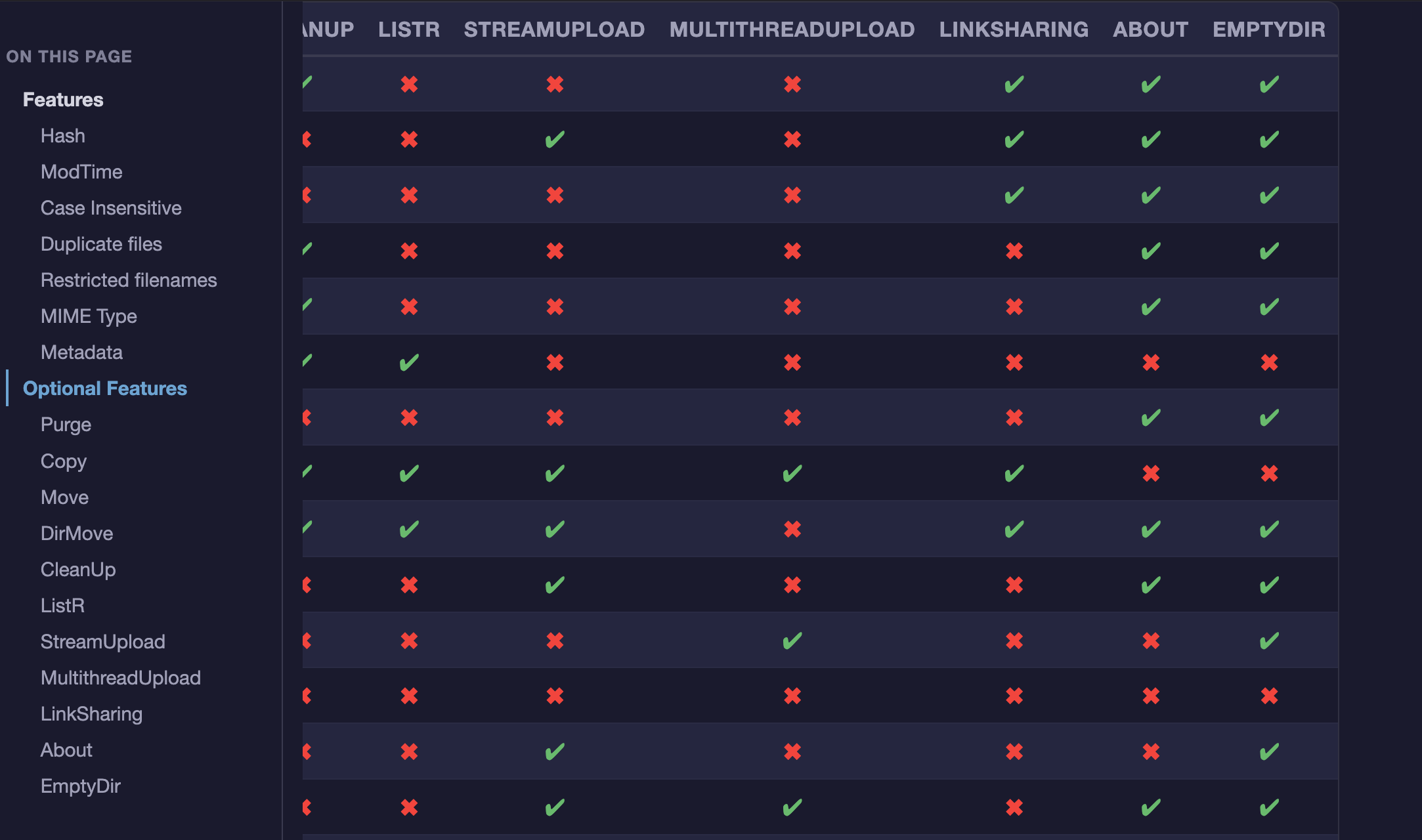
In long tables like here or here it is really difficult to track different columns when reading. Could the table header be repeated every 10 (or similar) rows?
style inline code like code blocks to distinguish from links @albertony
fix mobile dropdown menus for Commands and Storage Systems @abyss
centre wide dropdown menus under navbar
add filter input to Commands and Storage Systems dropdowns @albertony
add dark mode support based on browser preference @rclone-ui
replace deprecated site.Data with hugo.Data after updating hugo to latest version v0.159.0
I think that is all the feedback except for @nielash sticky navbar (voted down by the team who said press Home instead!) We didn't do @rclone-ui suggestion of copy as markdown - you can see the source of the page if you click the link at the bottom of the page.
I think the mega menus (as we've been calling them) turned out quite nicely - I like the multi columns and the filter.
One of these tables (and actually the one I use a lot) is still a bit problematic. Due to its size it is real pain in the neck. Sticky header helps. But it only solves half of the problem:) Now what about sticky first column (NAME)?
Scrolling vertically I can see nicely all properties names all the time:
Wow, that's a rather big update with lots of nice improvements.
I'll check it out later, for now I can only confirm that the mega menus looks very nice!
One question: Is there a trick to force light mode / dark mode of the website, without switching in the browser settings? I'm just wondering, primarily for testing it would be convenient for switching between them to compare etc., but I'll manage without it..
Sure, no worries, I'll just do the same, don't need to add a button for it. (I will not be extremely surprised if someone asks for it at some point, but I will not...)