Hello again,
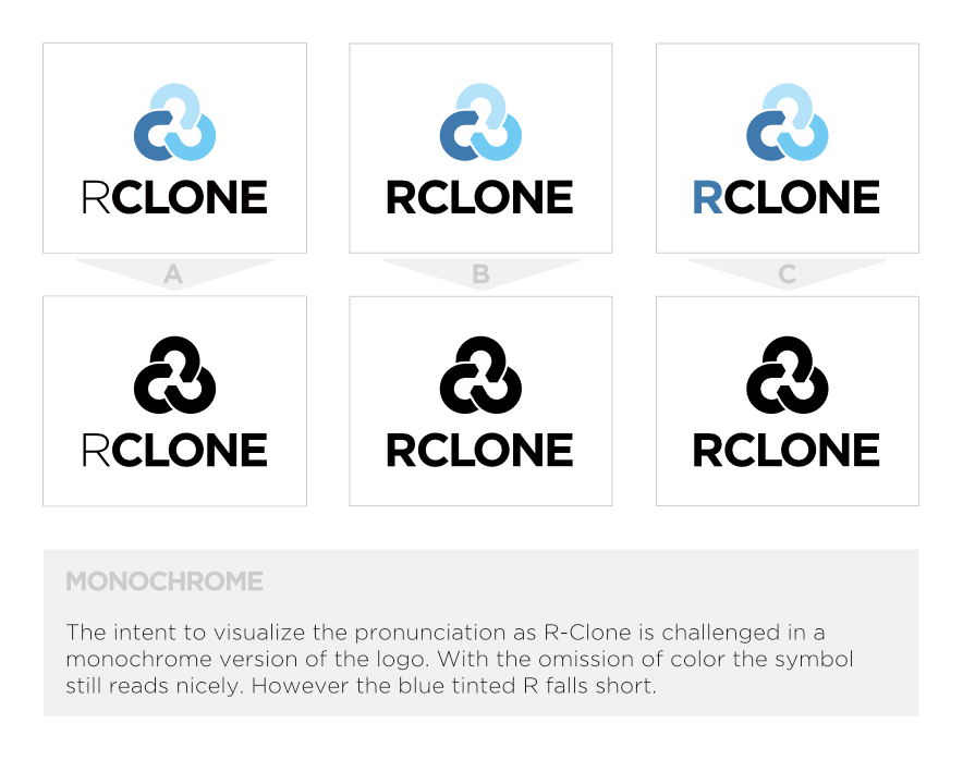
I’ve fiddled around with the blue tinted R and tried to make it work in various sizes. Unfortunately its visual perception varies a lot with different scales of the logo. Another thing that arose is the issue when displaying the logo in a single color. As you can see the pronunciation effect in the blue R version is completely lost.
I thank you all for your feedback and suggestions. After the typo iteration process I’m at a point where I’m convinced it’s best to stay with a single color for the typography and the ‘lighter’ R.
Cheers,
Andy