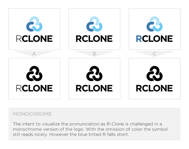
I actually like the first version with the “thin” R better. I didn’t even notice that it was thinner, it just looked right. The C version (with the R in light blue) looks fine as well but the first version is better imo. Giving my $0.50 to provide some perspective since the anti-thin R have been so vocal about it 
I vote for “B”, where R is also bold, but not blue.
On the C version I didn’t like the blue color. It’s somehow to weak for me that way.
@Andy
Could you show us your ideas for a GUI. I am thinking of starting a python based rclone GUI and would love to get some input on how it should look like.
Hello again,
I’ve fiddled around with the blue tinted R and tried to make it work in various sizes. Unfortunately its visual perception varies a lot with different scales of the logo. Another thing that arose is the issue when displaying the logo in a single color. As you can see the pronunciation effect in the blue R version is completely lost.
I thank you all for your feedback and suggestions. After the typo iteration process I’m at a point where I’m convinced it’s best to stay with a single color for the typography and the ‘lighter’ R.
Cheers,
Andy
Hi gelsas,
I haven’t fully visualized any ideas I have in my head. That will happen when I have a bit more time to spare. Have you started your project yet?
Thanks for doing another iteration ![]()
I see what you mean. Fascinating!
I hadn't thought of the prononciation being habituated to the word rclone.
I think you've convinced me too - I'd be interested to hear what others think.
I do love the “A” version - thin black R with colored icon.
Hello there,
it’s been some time and there hasn’t been more feedback. Should I finalise the files for new logo?
Again, thank you all for your feedback and suggestions.
Andy
I was thinking the same ![]() Lets finalise the design and get it out there - thank you.
Lets finalise the design and get it out there - thank you.
Hi
When will you update your new logo ?
Regards
Soon! I have the files from Andy - I hope to do it as part of the v1.46 release process!
this looks great. why arent we using it yet?
We will be soon 
This is great. Not just a well crafted logo, but obviously a lot of time and consideration has gone into the design aspect and long-term application. I couldn't think of much to improve here if anything.
Personally I like the option A best, and option C second.
C may look more fancy, but A is very clean and there is some added visual confusion in C where the blue R can be missed at a glance by seeming to be more a part of the logo than the name due to sharing a color. Both are very good, but A is super clean and professional looking while being more than enough aesthetically pleasing as-is.
It looks like it should work well in very small sizes too (like file icons) because it's not overly detailed.
rclone player:


this looks great! nice work! I like c best 
Is the new logo posted anywhere by itself? Would be great to use it as the app icon for Rclone Browser to replace the old one
sure, you'll find it here: https://github.com/rclone/rclone/tree/master/graphics/logo
i had no idea there was an 'rclone browser'
