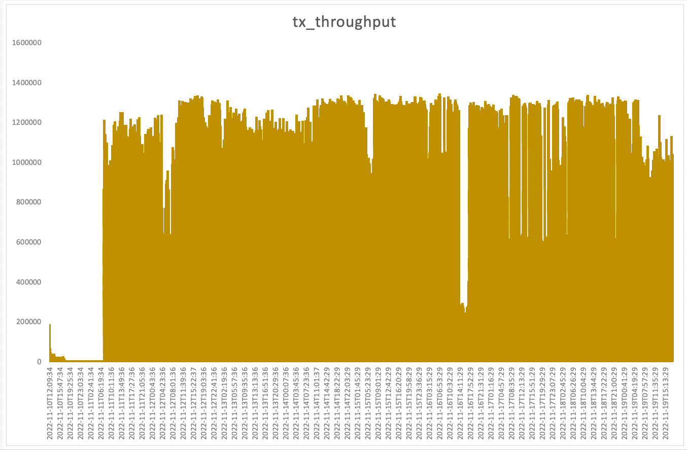
Has anyone already come up with a good way to process the summary stats from rclone.log into graphical format? I'm running backup jobs that run for multiple days (slowish ISP upload speed). I'm interested to see the effect of tuning parameters such as --transfers=.
I was thinking to read (or tee) the logfile output through a script to produce a time-series chart.
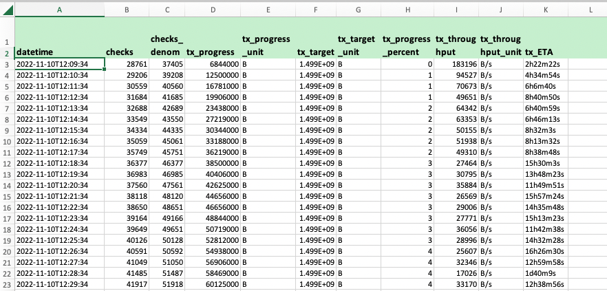
I made a Python script to pull the date/time and the Transferred: stats out of a human-readable rclone.log. Maybe I should have tried the JSON log output, or the --stats-one-line-date instead, but this seems to work.
TODO: check how rclone treats timestamps with the computer's locale; at the moment it's easy in UK winter time.
Realtime time-series views might be better done via the new GUI web app, or Jupyter Notebook, or Google Data Studio etc.